Iron Health
National
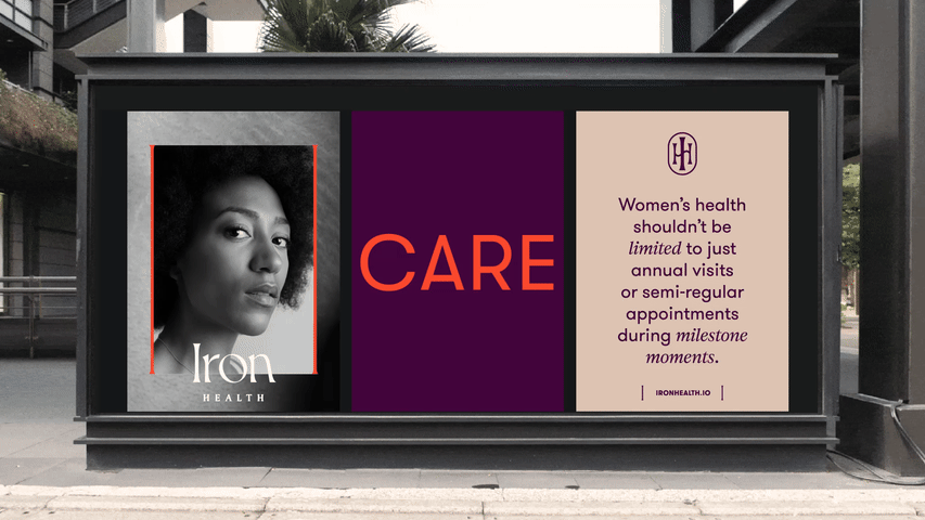
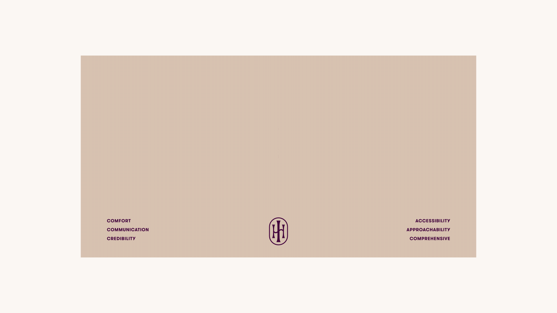
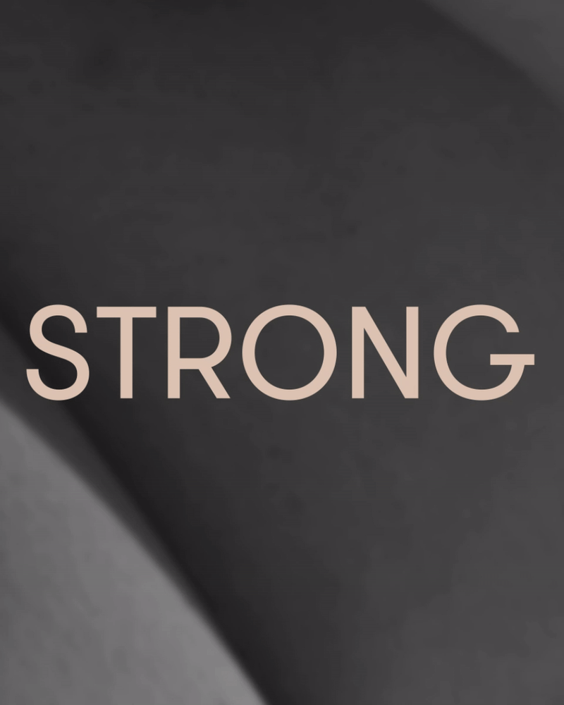
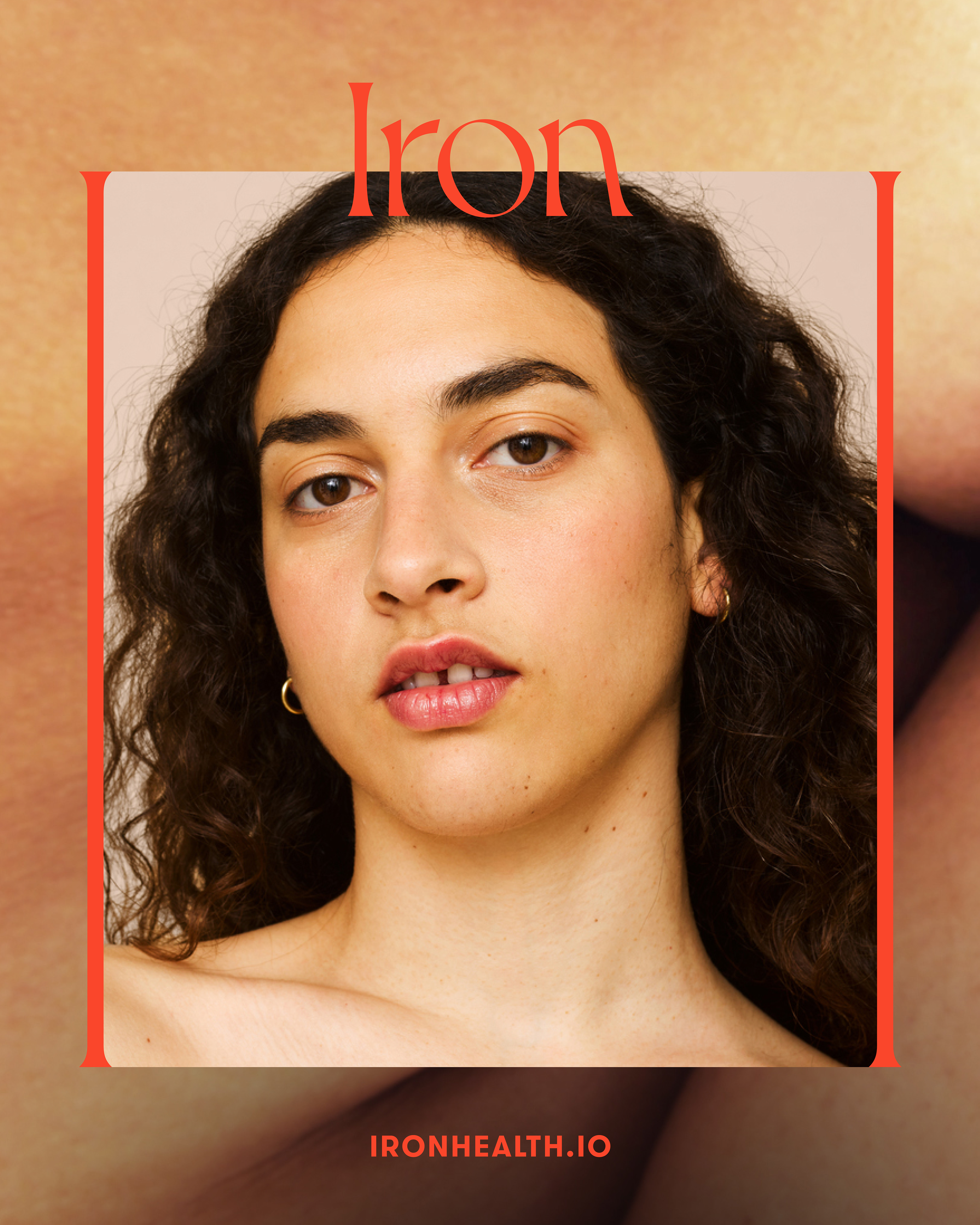
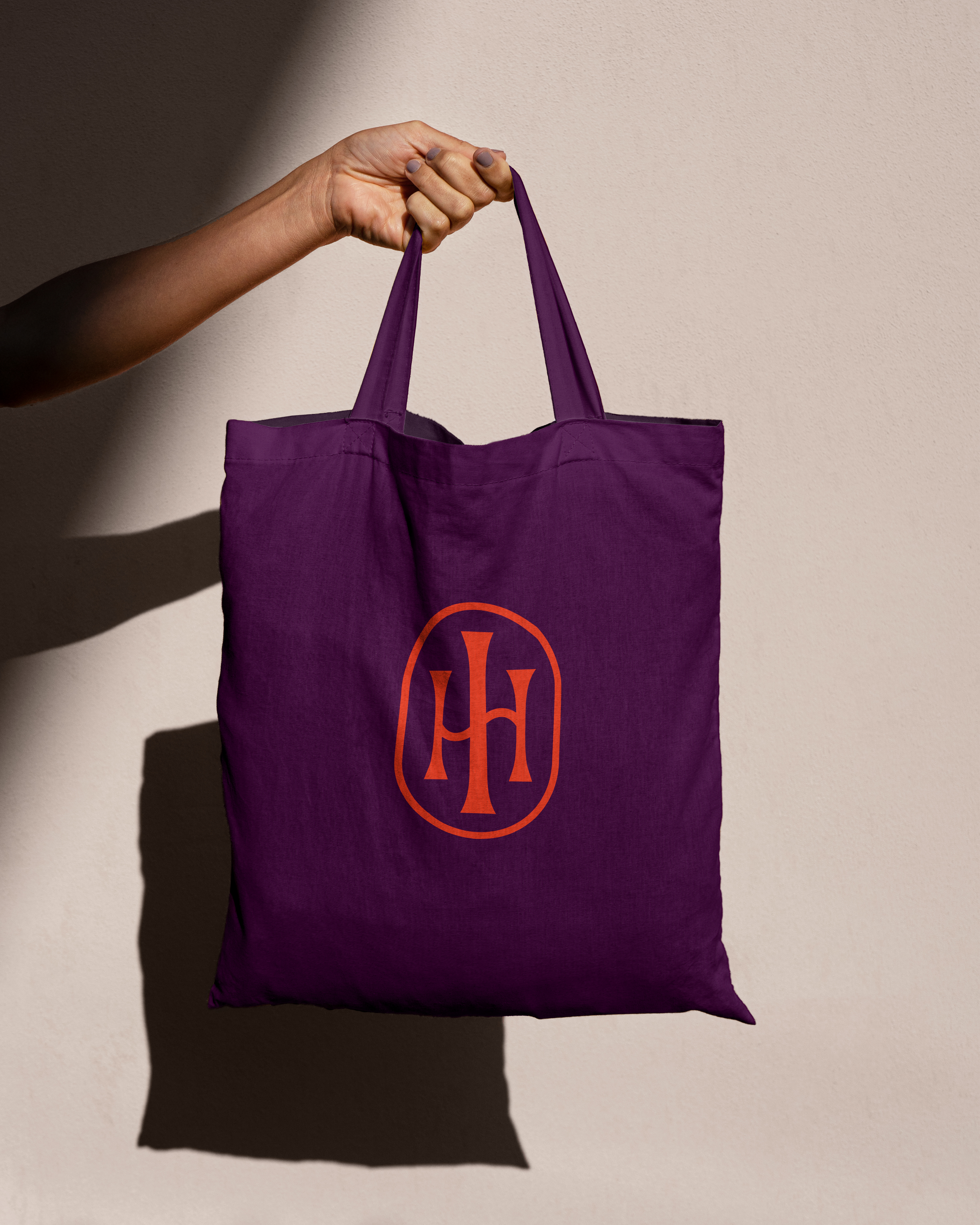
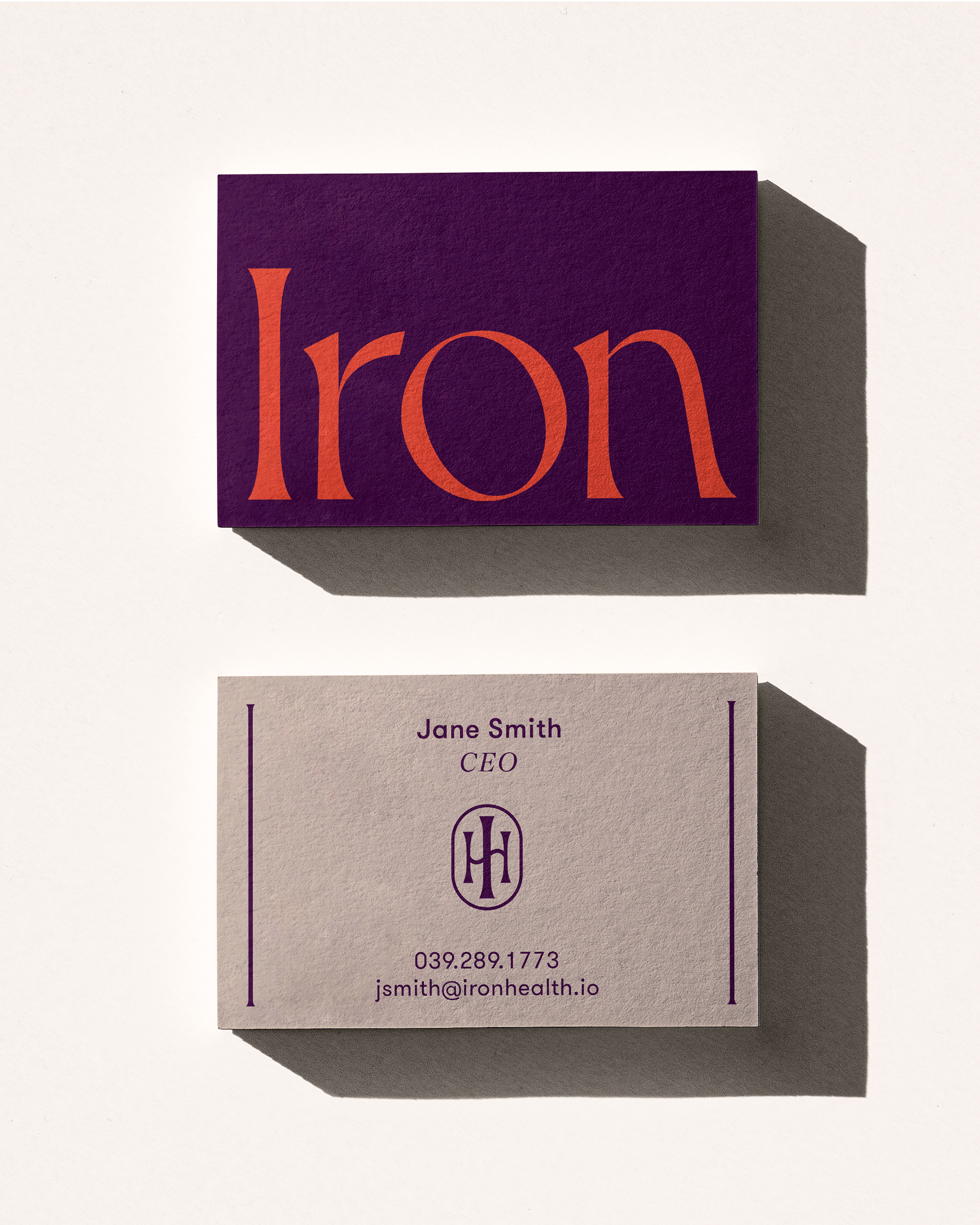
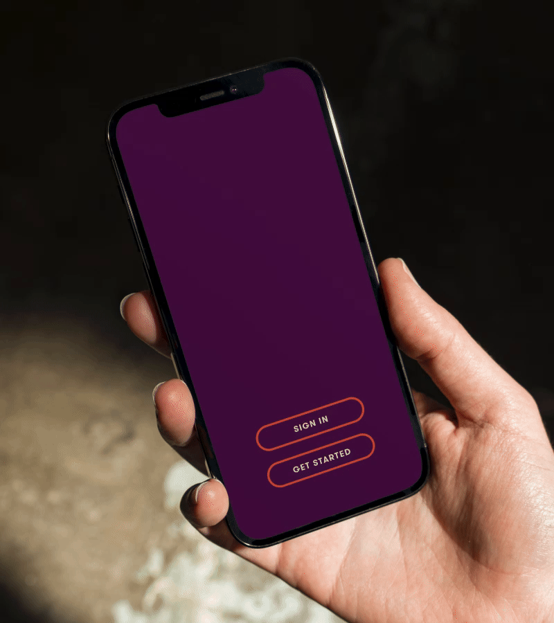
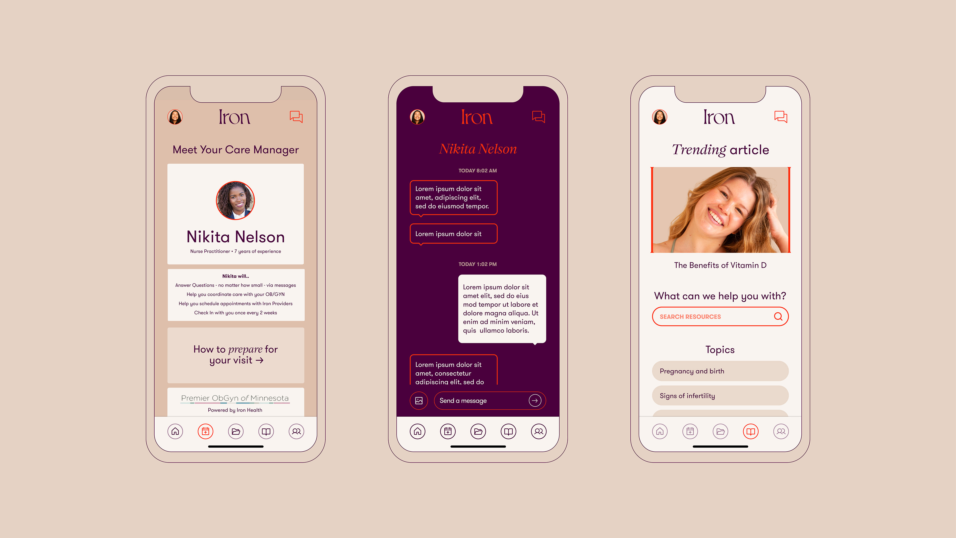
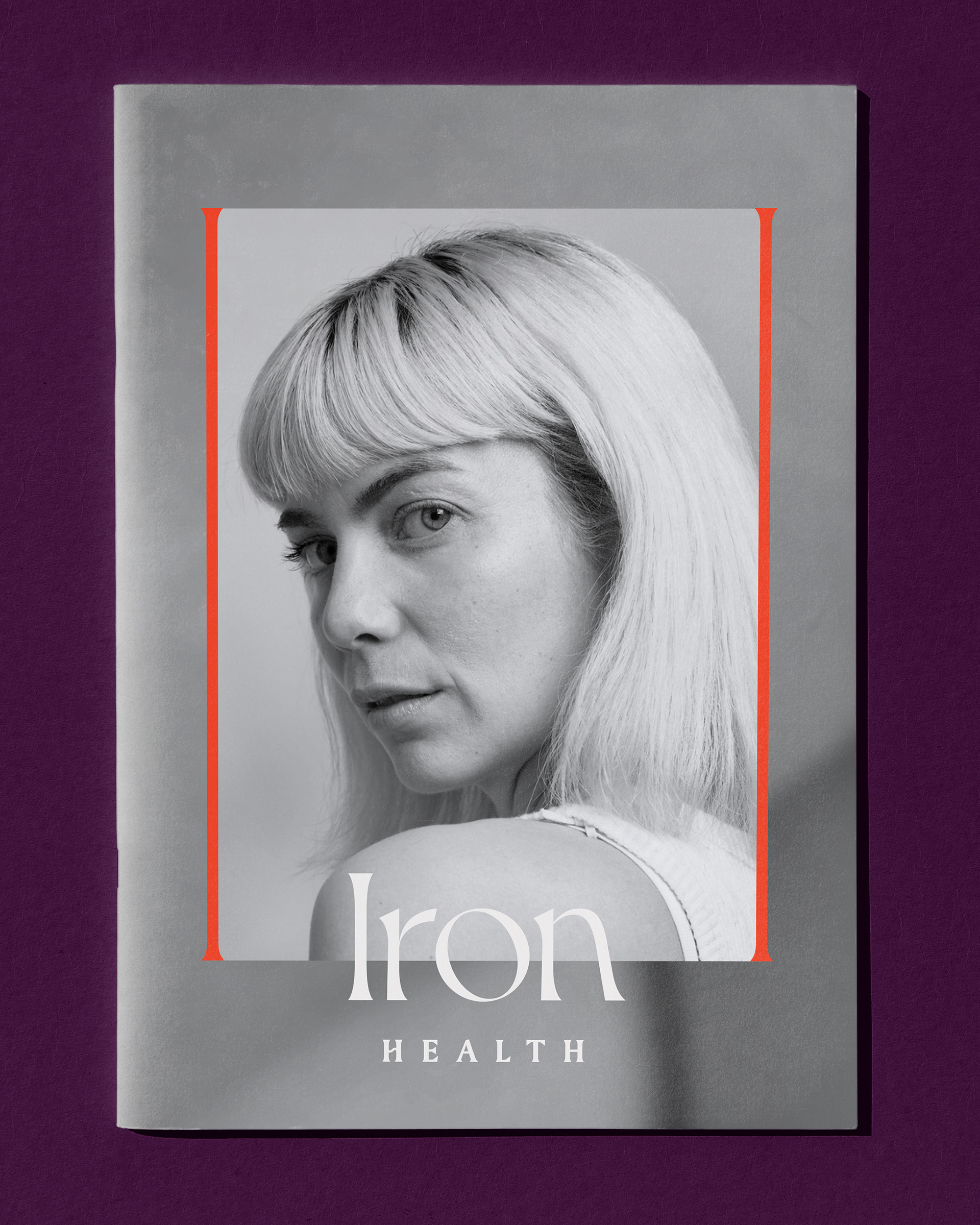
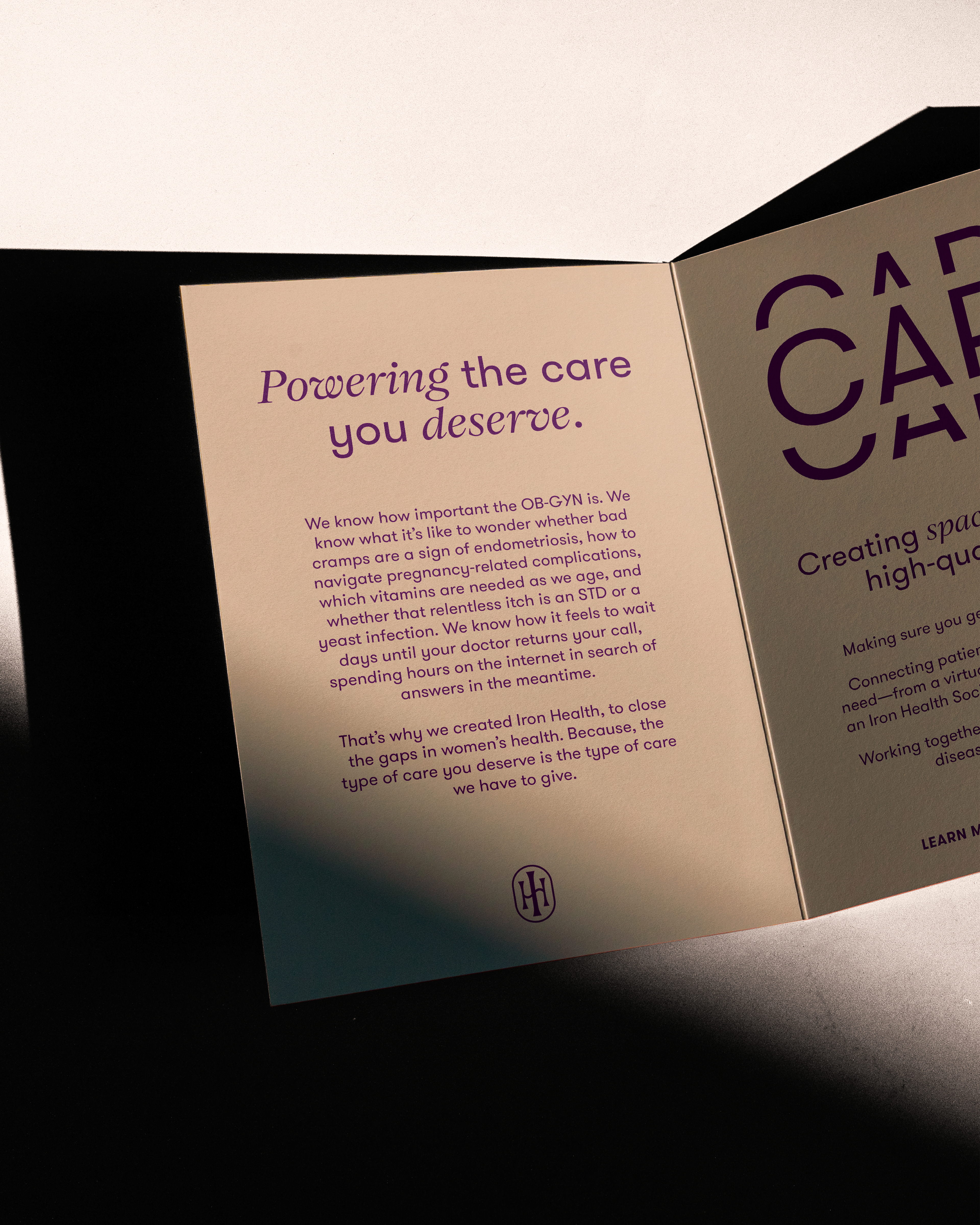
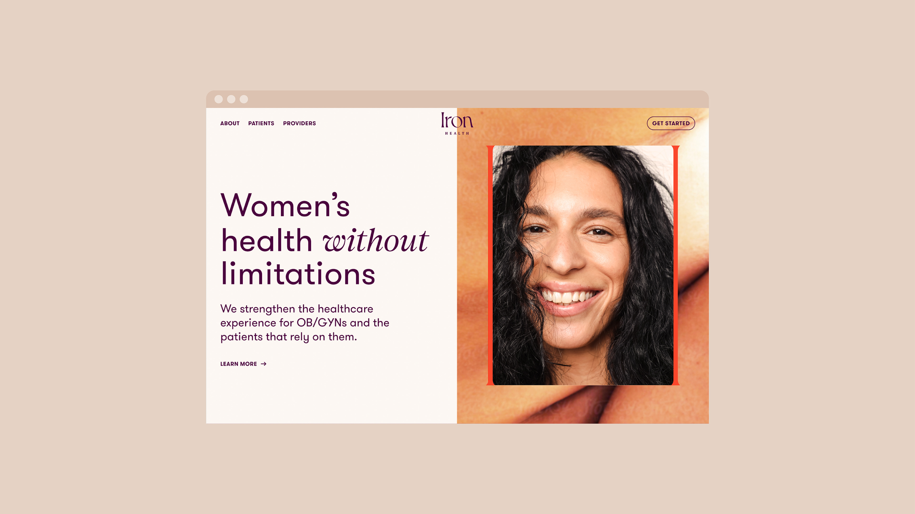
The design system is anchored by a custom logomark that features the "I" and "H" of Iron Health as pillars. Utilizing motion design, our team showcased how the pillars can expand to house visuals and key messaging. The curved crossbar of the "H" showcases the duality and complexity of patient care. Photography became an important visual element for the brand, and our art direction set out to celebrate the strength and beauty of the natural human form, with layered portraiture photography and abstract figure photography.
Brand Identity, Print Collateral, Art Direction, Digital Design, Brand Guidelines, Production
Role
Lead Designer; Associate Design Director
Lead Designer; Associate Design Director
Collaborators
Jolene Delisle, Creative Director
Ben Ross, Senior Motion Designer
Sarah Sprinkle, Senior Digital Designer
Jolene Delisle, Creative Director
Ben Ross, Senior Motion Designer
Sarah Sprinkle, Senior Digital Designer
Firm
The Working Assembly | 2022
The Working Assembly | 2022